CERAMICS ARE TRASH
Ceramics Storefront
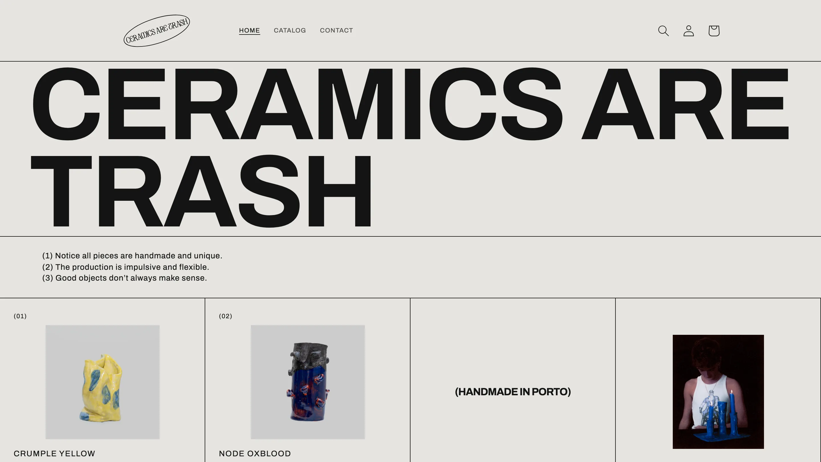
A Shopify store for a Porto ceramics workshop that sells lumpy, one-of-one pots as museum registry entries. On purpose.
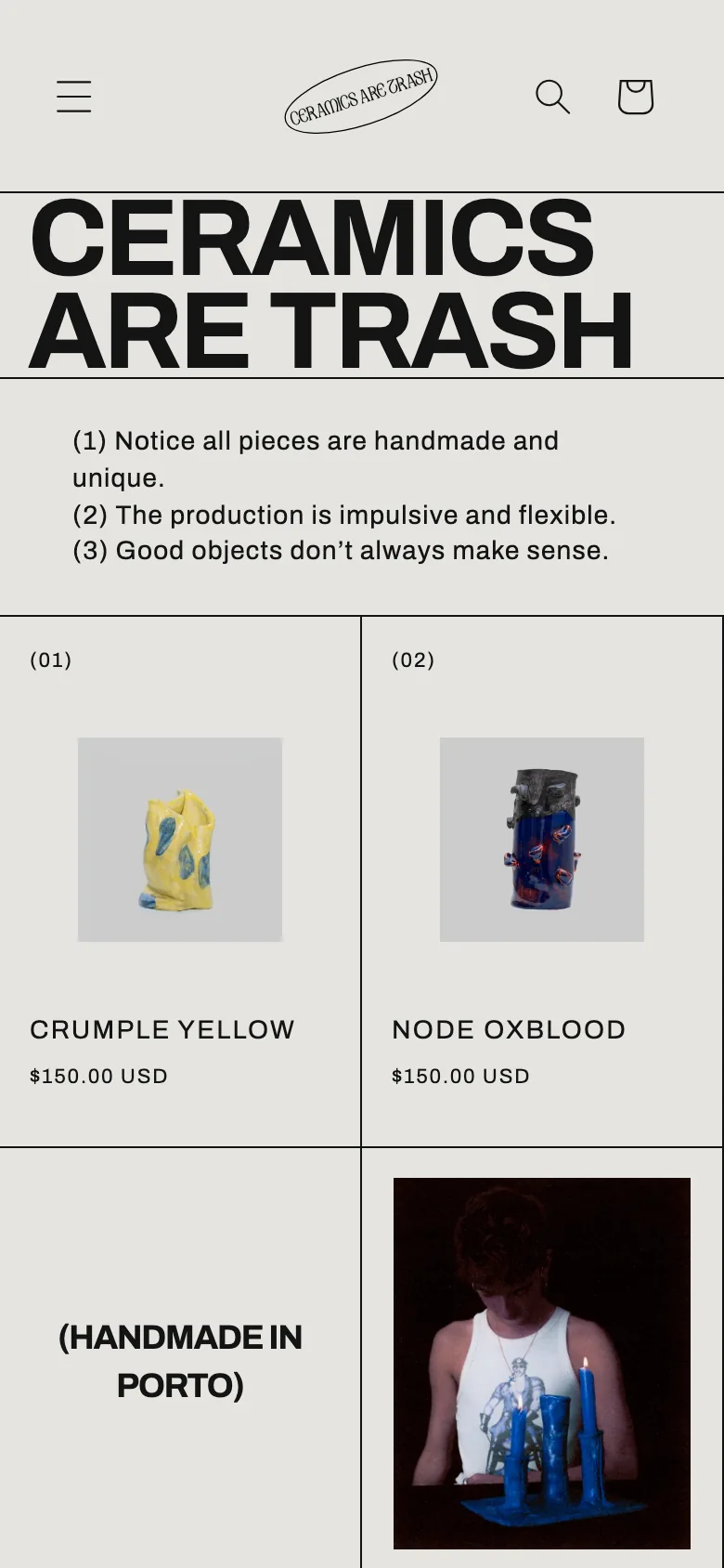
Mobile View
Fully responsive, designed for how your clients actually browse.
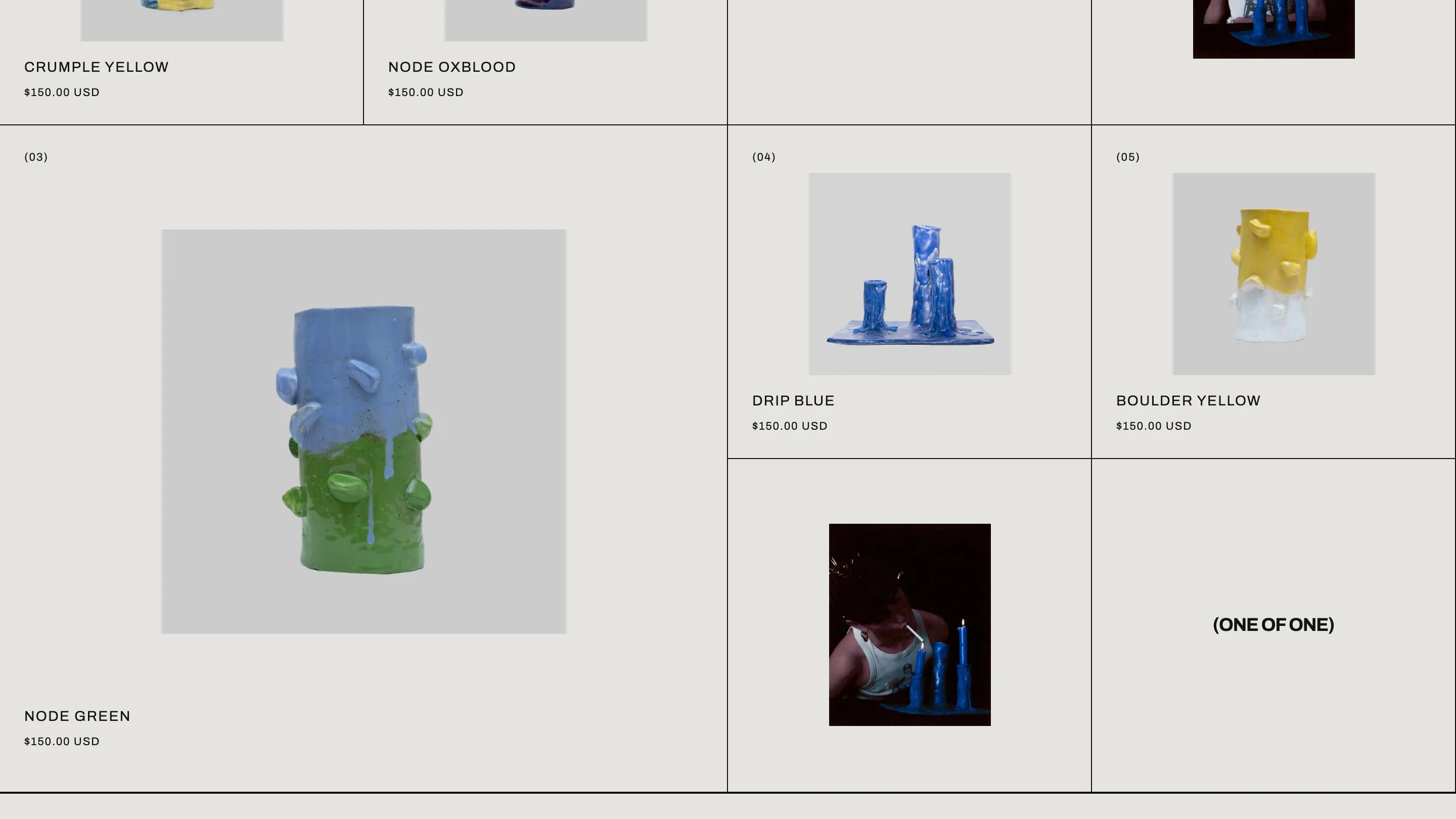
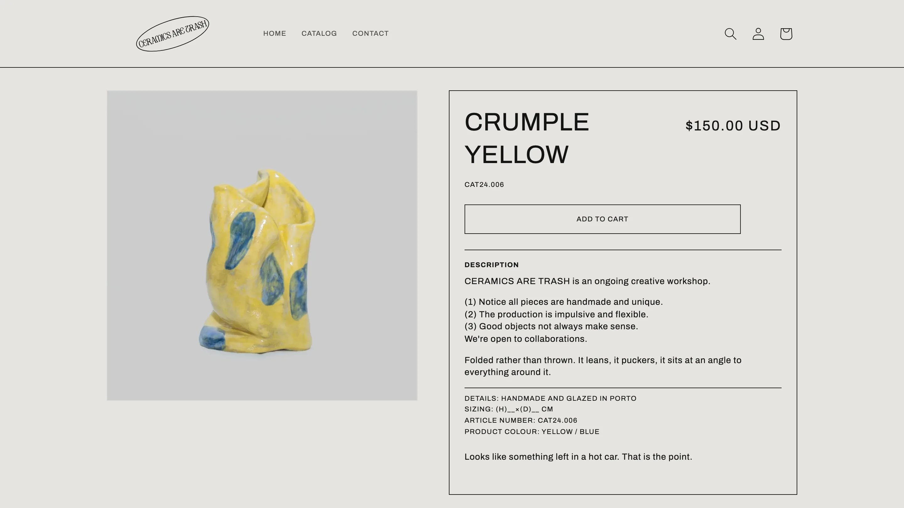
A custom-designed Shopify storefront where the catalogue is the brand: numbered entries, hairline grid, deadpan copy. Built by restyling Dawn's stock sections, so cart, checkout and accessibility stay standard Shopify underneath.
Every piece from this Porto workshop is one of one: slumped, drippy, deliberately imperfect. The name is a joke about exactly that. Where every other ceramics store sells calm (beige, linen, the word 'vessel'), this one presents the pots as entries in a museum registry. Numbered (01) to (05), catalogued, stated flatly. The design system is strict: one warm-grey ground, near-black type, one typeface, and 1px hairlines as the only decoration, so the pots are the only colour on the site. Product entries share the grid with bracketed statements like '(ONE OF ONE)' and campaign photos, and sold-out pieces stay visible at reduced opacity, because the catalogue is a record, not a stock list. Technically it's all Shopify: Dawn restyled through a single token layer of CSS custom properties rather than custom sections, which keeps the cart logic and accessibility intact and the whole thing cheap to maintain.
Client
CERAMICS ARE TRASH
Industry
Ceramics Storefront
Services
A closer look